Photo by Marcus Bellingham for Cornerstone Mansion · December 24, 2025
For years, I've crisscrossed this country, not just looking at buildings, but *experiencing* them. I’ve leaned against weathered brick, felt the hum of city life reverberating through steel frames, and tried to imagine the minds behind these monumental structures. The period between 1890 and 1915—America's turn of the century—was a crucible of architectural genius, a time when cities exploded skyward and new forms emerged from an industrializing landscape. We often celebrate these titans for their grandeur or their daring, but few guides really delve into the *why* or the *how* they still resonate today.
So, let's skip the superficial and dig into five buildings that aren't just pretty faces, but profound statements in brick, terra cotta, and glass. These aren't just stops on a tour; they're lessons in audacity, engineering, and the enduring power of design.
Chicago's Audacious Vision: The Auditorium Building's Herculean Challenge
Stepping into Chicago's Auditorium Building, you’re not just entering a structure; you're walking into a titan’s dream. Designed by the formidable partnership of Dankmar Adler and Louis Henri Sullivan, this monolith, completed in 1889, was nothing short of an architectural declaration. They didn't just aim for a grand theatre; their vision encompassed a massive 4,200-seat performance space, a luxury hotel with 400 rooms, and 136 offices and retail establishments, all seamlessly integrated into one gargantuan complex. It was a city within a building, a testament to Chicago's boundless ambition after the Great Fire.
What truly sets the Auditorium Building apart from its contemporaries, and often gets glossed over in standard tours, is the sheer audacity of its engineering. Chicago, remember, sits on soft blue clay—hardly ideal for supporting a structure this immense, which cost a staggering $3,200,000 to $3,500,000 at the time, making it the most expensive building in the city. Adler, collaborating with engineer Paul Mueller, devised a revolutionary solution: a "raft foundation." This wasn't some flimsy patch; imagine crisscrossed railroad ties topped with a double layer of steel rails, all embedded in concrete and coated with pitch. This immense floating mat distributed the building's colossal weight, preventing it from sinking into the notoriously unstable soil. It's a testament to their ingenuity that, over a century later, the building still stands, a quiet defiance against gravity. When you visit today, try to visualize this engineering marvel hidden beneath your feet; it provides a deeper appreciation for what seems like sheer brute force from the exterior.
The sheer scale of the Auditorium can be overwhelming, and while its theatre remains an active, beautiful venue (check for performance schedules!), the hotel and office portions have seen various transformations. What strikes me every time is the palpable sense of a bygone era's opulence and the almost overwhelming decorative details Sullivan lavished on the interior. It’s a bit like stepping into a time capsule, where every arch, every mosaic, whispers tales of Gilded Age extravagance. Don’t just look up; examine the smaller, human-scaled details where Sullivan’s genius for ornament truly shines.
Decoding Transparency: The Reliance Building's Precocious Modernism
Just a few blocks from the heavy masonry of the Auditorium, another Chicago marvel, the Reliance Building, offers a stark contrast and a glimpse into the future. It’s a building that, to my eye, still feels startlingly modern, even though its primary construction wrapped up between 1894 and 1895. What makes it unique, and often overlooked, isn't just its groundbreaking use of materials but the incredibly human story of its construction. Designed by Charles Blakewell Atwood, following the death of initial designer John Wellborn Root, the building was constructed in phases—the lower floors by Root in 1890, the upper ten by Atwood—*while the existing tenants occupied the upper floors*. Imagine the disruption: supporting three stories on jackscrews as new construction rose beneath them! It speaks volumes about the relentless pace of innovation (and perhaps the desperation for office space) in late 19th-century Chicago.
The Reliance Building’s most enduring legacy, however, is its revolutionary facade. This was the first skyscraper to embrace massive plate glass windows as its dominant exterior material, ushering in an unprecedented sense of transparency and lightness. Unlike the fortress-like buildings of earlier eras, the Reliance felt almost ethereal, its white-enameled terra cotta ornamentation forming delicate bands that framed the expansive glazing. The choice of white terra cotta wasn't just aesthetic; it was also practical, chosen for its "hygienic appearance," a deliberate appeal to the many doctors and dentists who leased office space within. When you stand across the street and look up, the building doesn't feel solid; it feels like a delicate, intricate cage of light. Its windows were "made as large as the situation of the columns would allow," pushing the boundaries of what was possible and anticipating the curtain wall designs that would define the International Style decades later. This isn't merely historical; it's a living lesson in how materials and engineering can redefine an urban aesthetic.
Visiting the Reliance today, you'll find it beautifully preserved, often surprising those who expect a grittier, older Chicago. The ground floor now houses a hotel, providing an opportunity to experience its interior details up close. Pay particular attention to the ornamentation, which, despite its delicate appearance, is deeply integrated into the building's structural expression—a hallmark of the Chicago School.
Buffalo's Hidden Gem: Sullivan's Poetic Guaranty Building
When the topic of Louis Sullivan comes up, most conversations inevitably gravitate toward Chicago. Yet, tucked away in Buffalo, New York, stands the Guaranty Building—or the Prudential Building, as it's also known—a stunning testament to Sullivan's mature genius, arguably one of his most perfectly realized "tall office buildings." Constructed between February 1895 and March 1896, this 13-story, 152-foot structure was originally commissioned by oil magnate Hascal L. Taylor, though his death saw the project pass to the Guaranty Construction Company. It’s a building that doesn't just reach for the sky; it sings a song of organic growth and intricate detail.
What makes the Guaranty so compelling, and why I urge anyone serious about architecture to make the trip to Buffalo, is Sullivan's masterful application of his "seed of life" motif. This isn't just decoration; it's a philosophical statement, an Art Nouveau-inflected organic pattern that literally draws your eye upward, emphasizing the building's verticality while simultaneously grounding it in natural forms. Sullivan, famously declaring "form ever follows function," designed every element of the terra cotta ornamentation himself, ensuring a seamless integration of aesthetic and structural expression. The oxidized copper ornament and the meticulous proportional relationships don't just adorn the building; they articulate its steel frame skeleton, a revolutionary construction technique that became standard practice throughout the country. Unlike some of his larger Chicago works, the Guaranty feels contained and utterly complete, a singular, powerful statement of architectural truth.
Buffalo, though not as bustling a tourist destination as Chicago or New York, offers an unhurried perspective on this architectural masterpiece. Spend time examining the terra cotta up close, especially around the entrance and the upper stories, where the intricate details are most legible. It's a building that rewards patience and close inspection, revealing new layers of Sullivan's genius the longer you gaze. This isn't just a building; it's a piece of poetry carved into the urban fabric.
New York's Icon: Unpacking the Flatiron's Urban Mythology
Crossing into New York City, we encounter the Flatiron Building, a structure so instantly recognizable it feels less like a building and more like a symbol of urban ambition. Completed in a remarkably swift year between 1901 and 1902, it was initially dubbed the Fuller Building, named after the construction company that built it. Designed by Daniel Hudson Burnham and Frederick P. Dinkelberg, the Flatiron became an icon not through intricate ornamentation, but through a brilliant, almost defiant, response to an impossible site. Its triangular massing, created by the intersection of Fifth Avenue, Broadway, and East 22nd Street, didn't just solve a difficult land constraint; it created a distinctive prow that sliced through the urban fabric.
Initially dismissed by some critics as "Burnham's Folly," the building, which cost approximately $325,000 to construct, quickly won over the public and became one of the most photographed buildings in America. What typical guides often miss, however, is the Flatiron’s enduring role in shaping the city's popular imagination. Its unique shape famously created wind tunnels at its base, leading to the early 20th-century slang "23 skidoo" as police officers would shoo away men lingering to catch glimpses of women's skirts being blown up. This tidbit, while perhaps apocryphal in its direct connection to the phrase, underscores how the building immediately became an active participant in urban life, not just a backdrop. Its facade, adhering to classical proportions with a base, shaft, and capital in limestone and glazed terra cotta, might seem conventional, but it's the *form* that truly captured the public's imagination.
If you plan to visit, prepare for crowds; this is one of New York's enduring photo opportunities. To truly appreciate its form, walk a few blocks north on Fifth Avenue or Broadway and look back. The best light for photography is often in the late afternoon, when the sun catches its western face. Don't just snap a picture and leave; take a moment to consider how this daring geometric solution transformed an awkward intersection into one of the city's most beloved landmarks, proving that sometimes, the most challenging constraints lead to the most iconic designs.
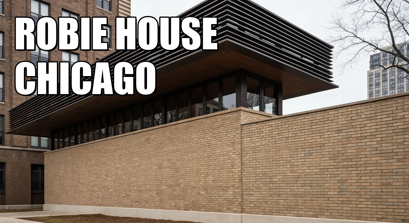
Wright's Prairie Manifesto: The Enduring Radicalism of the Robie House
Finally, we return to Chicago, but this time to a residential masterpiece that shattered conventional notions of domestic architecture: Frank Lloyd Wright's Frederick C. Robie House. Constructed between April 1909 and May 1910, with final furnishings in place by early 1911, this isn't just a house; it's a complete architectural statement, a "total work of art" that epitomizes Wright's Prairie Style. What's often overlooked, or at least underemphasized, is the sheer financial and personal cost of this artistic vision. The final residence cost $58,500—nearly three times the average cost of a home at the time—including $14,000 for the land, $35,000 for design and construction, and another $10,000 for the custom furnishings. Yet, the Robies only owned the property for two and a half years, living in it for just over a year before financial hardship forced its sale. It's a poignant reminder that even architectural brilliance couldn't always override economic realities.
The Robie House stands as a radical departure from the vertical, boxy Victorian homes of its era, instead embracing an emphatically horizontal aesthetic—a true "marriage to the ground." Its most distinctive innovation is the dramatically extended cantilever, with portions of the main structure reaching out far beyond their visible supports, all thanks to a central 110-foot-long steel channel beam. This wasn't just an engineering feat; it was a philosophical statement, blurring the lines between interior and exterior, providing expansive views, and creating sheltered outdoor spaces. Wright, famously meticulous, designed not only the building but also 29 different art glass patterns for its 175 window and door panels, along with all the interior furnishings. This complete integration, while creating a harmonious environment, also meant that altering any part of the house meant disrupting Wright's carefully conceived whole.
Visiting the Robie House demands a guided tour to fully appreciate its nuances. Book well in advance, especially if you plan to visit during peak tourist season (summer or around university breaks). Aim for an early morning weekday tour in the spring or fall when the light is softer, and the student groups are less prevalent. You'll gain a far greater sense of its revolutionary open-plan interior and the way Wright orchestrated light and space. Be prepared for a space that, while visionary, might feel surprisingly intimate, almost compressed, in person compared to its expansive reputation. It challenges your preconceptions of what a home, particularly a grand one, should feel like.
These five buildings, each remarkable in its own right, collectively tell the story of a nation finding its architectural voice. They weren't just built; they were *forged* from ambition, innovation, and an unwavering belief in the power of design to shape human experience. Skip the superficial glances and dive deeper; these monuments demand and reward a discerning eye.
Architecture Styles You Can Read From the Street
Use visible details like rooflines, columns, and ornament to identify building styles faster.
Ultimate Guide to American Turn-of-the-Century and Mid-Century Modern Architecture
What is the turn of the century architecture style?
Turn-of-the-century architecture refers to residential styles popular from the late 1880s through the 1910s, including Victorian, American Foursquare, bungalows, Craftsman, and American Colonial Revival, characterized by simple forms, front porches, double-hung windows, and wood exteriors.
What is turn of the century style?
This style encompasses various architectural movements from approximately 1880-1920 that emerged due to rapid industrialization, mass production of building materials, and the transcontinental railroad, featuring simplified designs with functional elements and natural materials.
What are the 5 principles of modern architecture?
Le Corbusier's Five Points of New Architecture (1927) include: pilotis (columns supporting the building), free design of the ground plan, free design of the facade, horizontal windows, and roof gardens, forming the foundation of the Modern movement.
What is midcentury architecture?
Mid-century modern architecture is the design style from approximately 1933-1965, emerging after World War II, emphasizing simplicity, functionality, clean lines, open floor plans, and integration with nature using innovative materials like plywood and fiberglass.
Is MCM still popular in 2025?
Yes, mid-century modern design remains highly popular in 2025, with experts predicting its continued influence; the style is evolving to incorporate earthy tones, natural materials, and a blend of minimalism with maximalist elements.
What are common MCM house problems?
Common issues include galvanized pipes with limited lifespan, asbestos in tiles and insulation, lead-based paint, leaky roofs, drafty windows, poor insulation, and air sealing problems, requiring careful inspection and professional remediation.
How do you describe mid-century design?
Mid-century design is characterized by clean lines, organic shapes, minimal ornamentation, functionality, integration with nature through large windows, mixed materials, tapered furniture legs, earthy color palettes, and an emphasis on simplicity and form following function.
How do I identify mid-century modern?
Look for clean straight lines, organic curved forms, flat roofs with broad overhangs, asymmetrical designs, floor-to-ceiling windows, open floor plans, tapered legs on furniture, and a combination of materials like wood, metal, fiberglass, and plastic.
What does mid-century architecture look like?
MCM buildings feature horizontal massing with low-sloping or flat roofs, extended cantilevers, sweeping curves, exuberant asymmetrical shapes, large glass panels connecting interior to exterior spaces, minimal exterior ornamentation, and geometric forms with strong horizontal and vertical lines.
Turn of the century architecture guide
To explore turn-of-the-century architecture, visit major cities like New York, San Francisco, and Charleston; neighborhoods like San Francisco's Painted Ladies and New Orleans' historic districts showcase well-preserved examples; guided walking tours are available in most historic downtown areas.
What are the best US cities to see turn-of-the-century architecture?
Notable destinations include Newport, Rhode Island (The Breakers Mansion), Asheville, North Carolina (The Biltmore Estate), San Francisco (Painted Ladies), New Orleans, Chicago, Philadelphia, and the historic districts of Savannah, Georgia, and Old Louisville, Kentucky.
Where can I see the best mid-century modern architecture in the USA?
Top destinations include Palm Springs, California (most MCM inventory); New York; Austin, Texas; Denver, Colorado; Houston, Texas; Los Angeles; Chicago, Illinois; Las Vegas; Portland, Oregon; and Palo Alto, California.
When is the best time to visit Modernism Week?
Modernism Week occurs twice annually: February 13-23, 2025 (20th anniversary celebration with 400+ unique experiences) and October 16-19, 2025; February is the main event featuring bus tours, home tours, films, cocktail parties, and presentations in Palm Springs.
What is the average cost to renovate a mid-century modern home?
Home renovation costs range from $15-$150 per square foot depending on scope and complexity; for a 1,250-1,600 sq ft MCM home, expect average costs of $52,219, though high-end projects can exceed $100,000.
How much does it cost to visit historic architecture sites in the USA?
Costs vary by location; guided tours typically range from $10-$50 per person, while mansion estates like The Breakers offer day passes; some sites offer discounted group rates for 15+ people, and advance reservations are often required.
What are the requirements for visiting historic house tours?
Most historic homes require advance reservations for guided tours, entrance fees are mandatory, groups of 15+ may need to split into multiple tours, and some sites have specific operating seasons; check individual websites for hours and any ID requirements.
What tips should I know before buying a turn-of-the-century home?
Inspect thoroughly for lead paint (especially on friction surfaces), asbestos materials, structural integrity, original windows, plumbing systems, and foundation issues; consider that restoration costs can be high, and budget for professional testing and remediation of hazardous materials.
What are key characteristics of Craftsman-style turn-of-the-century homes?
Craftsman homes feature simplified details, exposed structural elements, prominent front porches, natural wood materials, built-in shelving, tapered porch supports, and decorative window details, typically built between 1900-1920 in California and other regions.
How does mid-century modern differ from contemporary architecture?
MCM originates from the 1940s-1960s emphasizing warmth and natural materials, while contemporary architecture reflects current design trends with technological integration; MCM uses earthy tones and organic shapes, whereas contemporary favors monochromatic schemes and geometric minimalism.
Why This Page Exists
Maison builds place guides to help readers plan a real visit or understand a real site. When a page makes present-day access, booking, or visitor claims, those details are revised against public-facing source material and editorial review. For the wider standards behind that work, see methodology.
The Cornerstone Brief
One historic place, once a week — what it is, why it matters, whether it's worth going. No filler, no paid placements.
Coming soon. Unsubscribe any time.
We use cookies to enhance your experience. By continuing to visit this site you agree to our use of cookies.